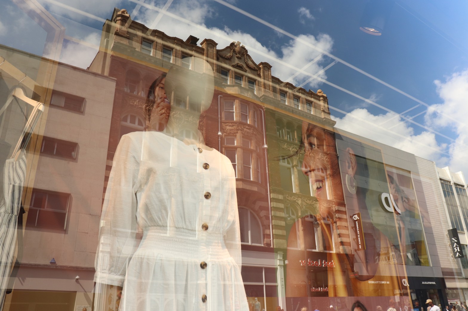
This arrangement is from one of my favourite shoots. Manchester is my favourite place to go to take pictures and one day whilst wondering around trying to find the right location I stumbled across a place called the hatch. I’ve taken pictures here a couple of times now and these were some of my favourites. I captured the model in a candid state which I felt made the images more fun and interactive which I felt reflected the environment well.
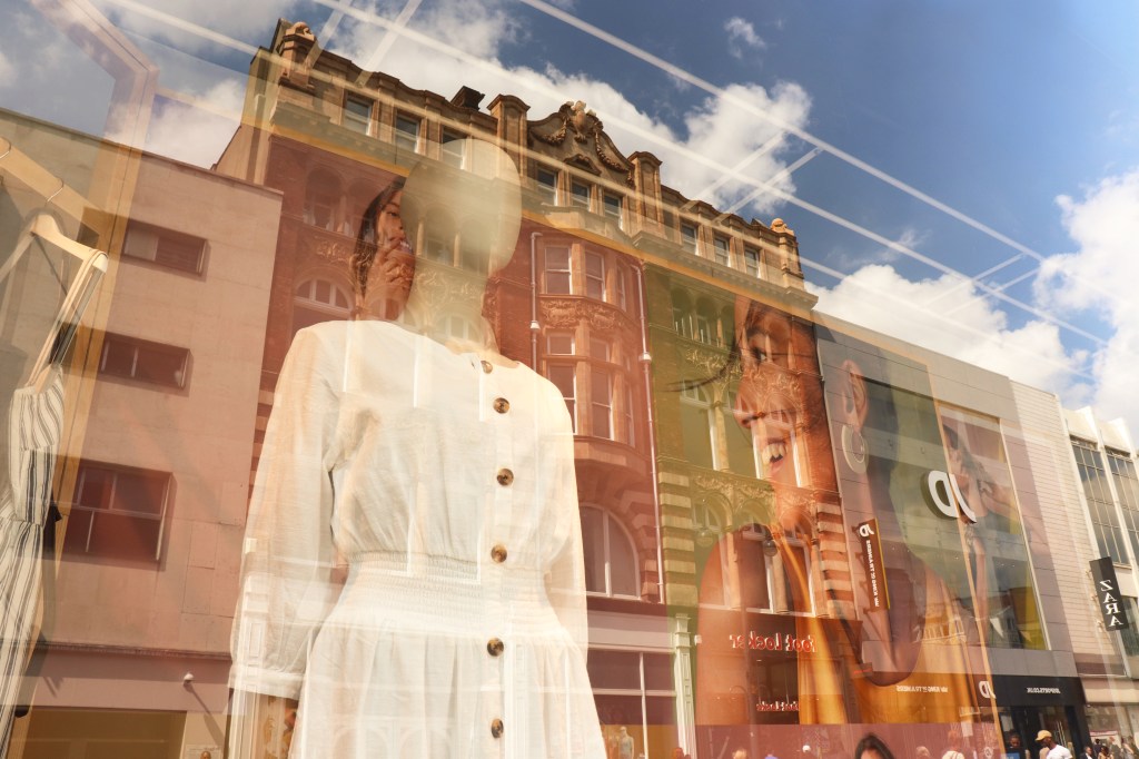
For this shoot the theme was reflections seen in shop windows. My aim was to use reflections of buildings in shop windows to create patterns on the mannequins. In this particular frame I liked how the woman’s face on the shop window display stood out against the old architecture which reflected in her face. I also enjoyed how elements of branding such as shop names and logos were visible. This reinforced the aim of the shoot to the viewer.
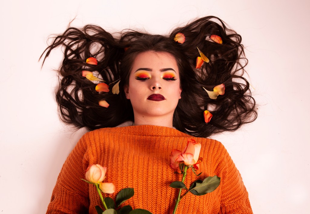
One of my shoots was influenced by social media photographer Andre Nguyen who often uses props and saturation within his photography. I took this influence on bored and used flowers and petals as my chosen prop. As well as focusing on props I also wanted to focus on the models make up, hence why I asked her to look down at the flowers. Another element of this photo that I liked was the contrast between the florals and the knit woollen jumper and the dark lip, almost representing elements of summer and autumn in contrast with one another.
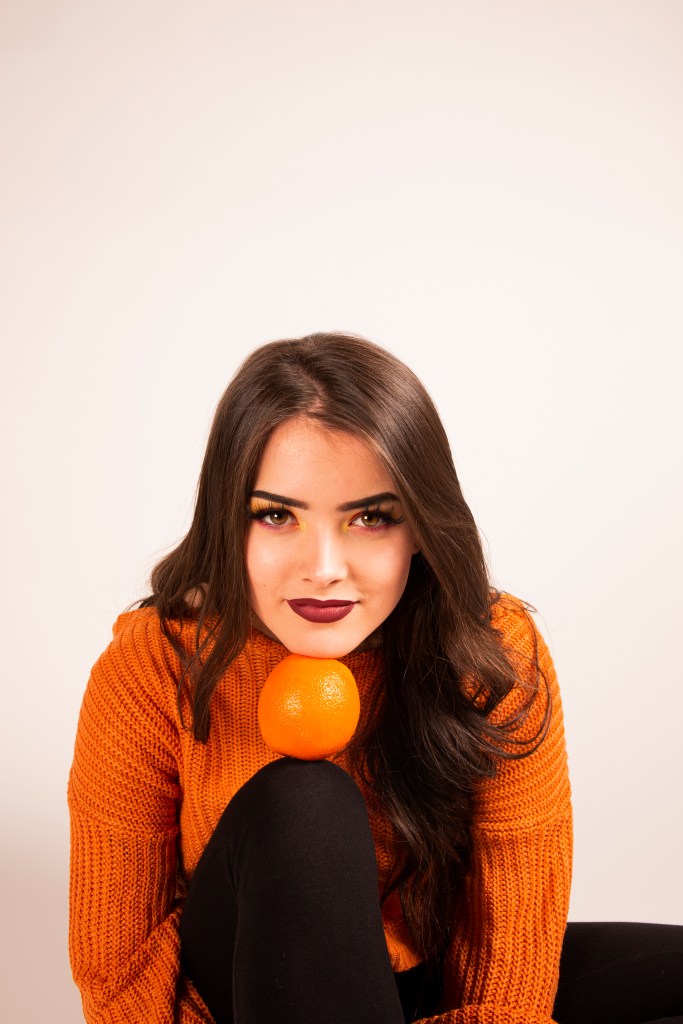
For this shoot I also took influence from Andre Nguyen who used bright colours and drastic highlights and shadows. Therefore, I decided to shoot head on for this image, so I was able to capture the highlights of the models face. The light picked up on the highlights of the models face however I decided to enhance them using the dodge tool. The positioning of the model also makes the image more interactive as she is looking right down the frame at the viewer. The aim of this shoot was to show how using such a simple prop such as a fruit in a more unconventional way can help to make the image become slightly more abstract and causes the viewer to question the use of the props.
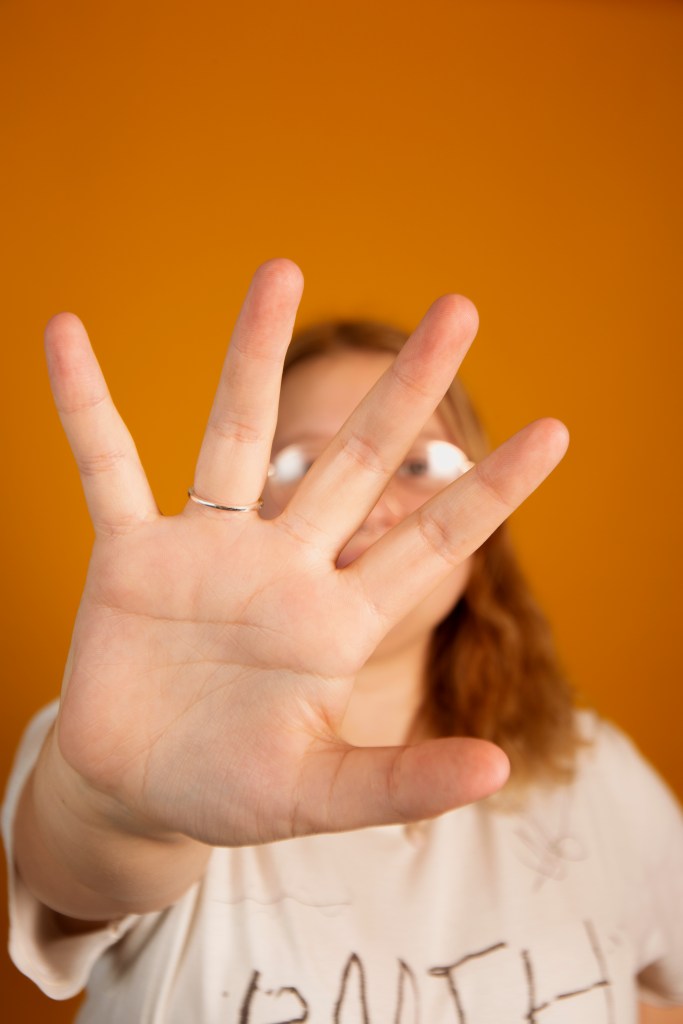
This is a photo I took as part of a shoot where I experimented with expression and identity. I had the model reach out to the camera, slightly covering her face, blurring it into a shallow depth of field. I liked how this image turned out as the model is choosing to block her face from the camera yet we can still vaguely make out her features still visible in the frame, for example the studio lights highlight the lenses in her glasses revealing something more personal about the model.
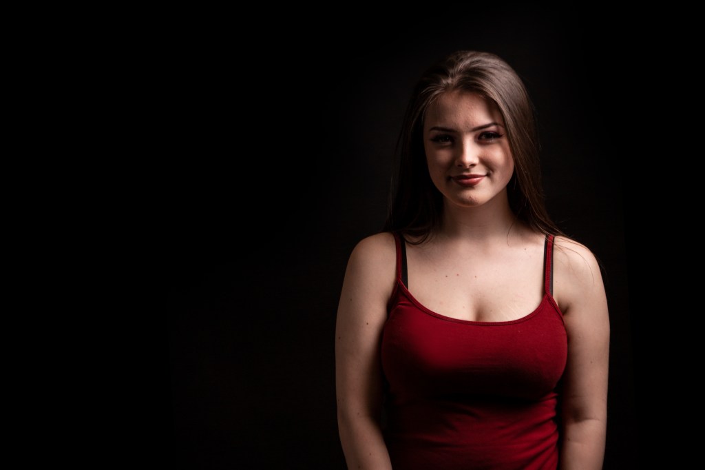
This image came from one of my original experiments with lighting. I wanted to use the lighting set up to highlight half of her face whilst leaving the other half darker with less detail. The lighting set up (lit from the right) created a drastic contrast between highlights and shadows down the nose. This framing was originally tighter however I decided to expand it in order for the negative space to direct the viewer to the model on the opposite side of the frame.
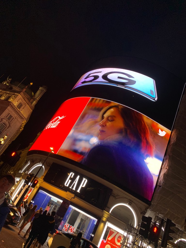
Although my preference when it comes to photography is portraiture I have also worked with architecture and street photography. Here is an example of a picture I took in London this summer. I quickly snapped this picture with my phone however this didn’t stop this image from becoming one of my favourites. Firstly, I liked the vibrancy of the colours of the billboard and how they reflected the energy and life of the city. I also enjoy how the woman in the advertisement is slightly blurred due to the movement of the video. I also though this highlighted the fast pace life of the city and how it never stands still, even for a photo.
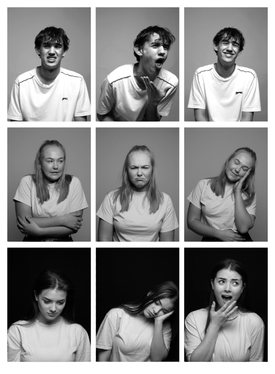
This grid arrangement is made up of various expressions I used within my expression shoot. I gave three models the same 16 emotions/feeling and captured how they differently interpreted them. With my final outcomes I decided to make a 3×3 grid to display the variety within the shoot. I decided to edit in black and white which meant no other colours were able to influence the atmosphere created within the frame.
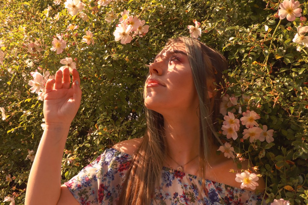
For this mini shoot that took place over the summer I wanted to create a hyper feminine look through the use of nature and natural lighting. In the editing process I enhanced the warm tones of the image making it softer and feminine. The lighting creates a gradient down the frame. The flecks of light also enhance to model’s face making it the focal point. I also enjoy the way the model’s blue hair flowed well with the pastel colour pallet that once again reinforces the idea of femininity.
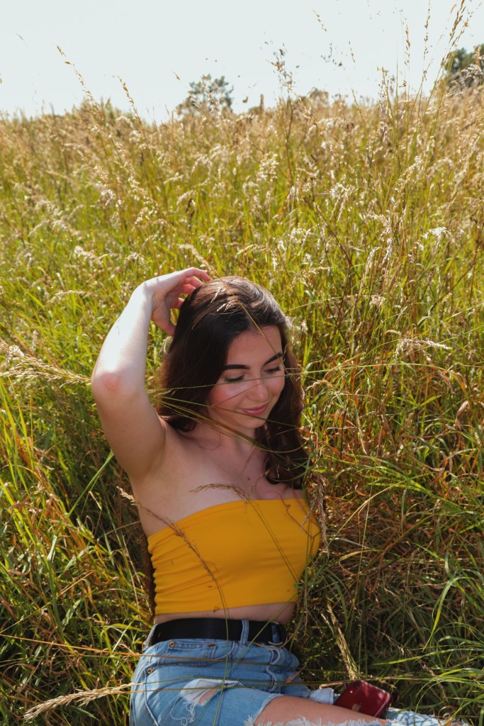
Here I edited the image to increase the warmth and saturation. This helped to enhance the colours and the idea of summer as the grass became a more prominent healthy looking green. Her skin also became more sun kissed creating a more feminine softer element to the image.
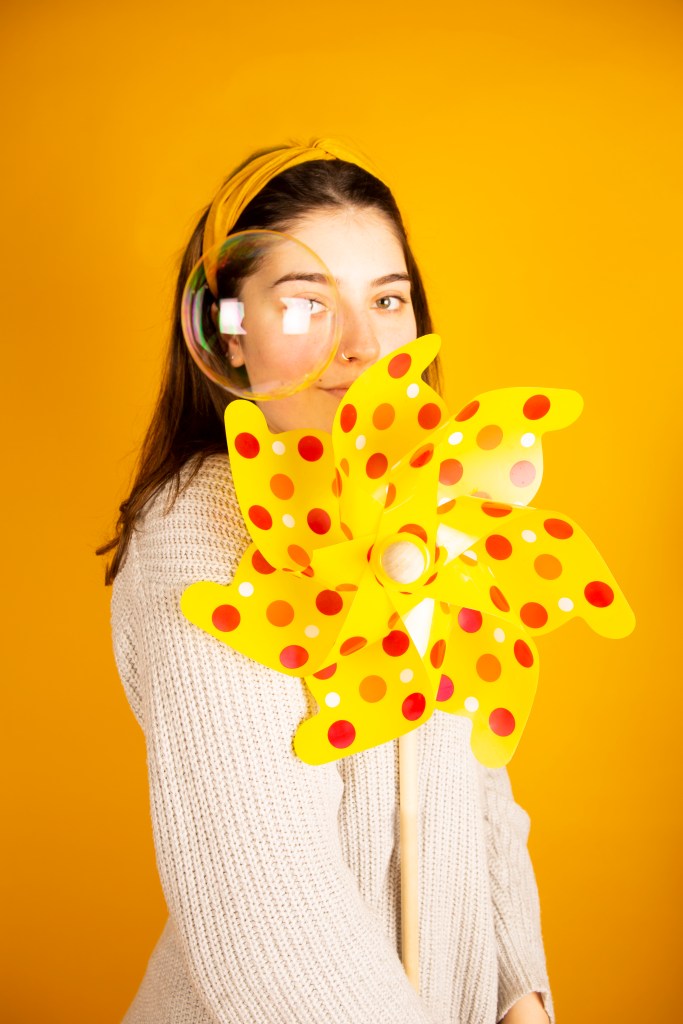
For this image I wanted to create a childish element through the use of colours and props. Choosing to use a yellow background instantly brightens the image and boosts the mood of the frame. I used a children’s windmill and bubbles as the props and I felt as though these both worked together cohesively. The placement of the bubble was particularly successful, covering the models eye helped to reinforce the props which were the main focal point of this shoot. The lights also helped to create a rainbow within the reflection which added to the use of colour and also attracted the viewer to this specific part of the image.
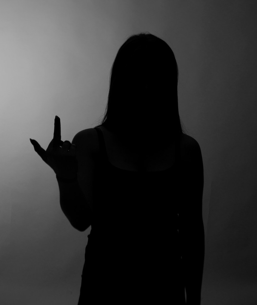
The theme of most of my image are mainly female empowerment. For this image I wanted to portray a strong woman therefore I used this stance to highlight how women are treated in society. I decided to use back lit lighting to create a silhouette. I felt as though a silhouette made this frame more interesting as it wasn’t important to see the woman’s faces. Women are often judged on their appearance, so I decided to not focus on that instead have the model reply to society through her body language which was enhanced by the back lighting and the black and white edit. The gradient leading to the left of the frame helps to reinforce the gesture the model is making it the focal point.
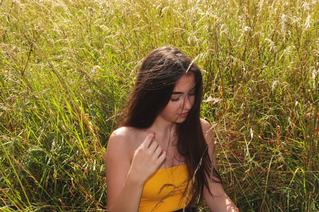
I again decided to capture my model in a more candid state as I thought it worked well with the more natural environment. I enjoyed how her hair looked wind swept as it made the frame more natural as sometimes what is seen as a natural pose or natural make up can really be the complete opposite.
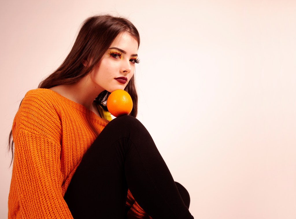
During my time experimenting with props I also experimented with the placement of them. The inspiration to use an orange came from a photo from an unknown photographer I found on Pinterest. They had positioned the fruit in a more abstract way. I decided to do the same testing different angles and positions to make the orange the focal point of the image. I liked how here the orange stood out being balanced between the model’s knee and chin and that the placement of it was reinforced by the negative space around the model.
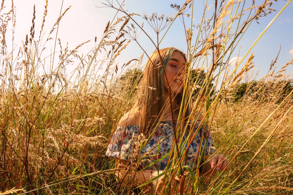
For this image I was influenced by the Daisy by Marc Jacobs perfume campaign. The use of warm, soft colours, nature and light leaks mirrors those used on the campaign. I directed the model to close her eyes and tilt her face in order for the sun to create highlights specifically capturing the detail of her golden hair. It also helped her to look more relaxed amongst the grass as though she is one with nature.
 Femme Fatale